Animal Sanctuary Kiosk System
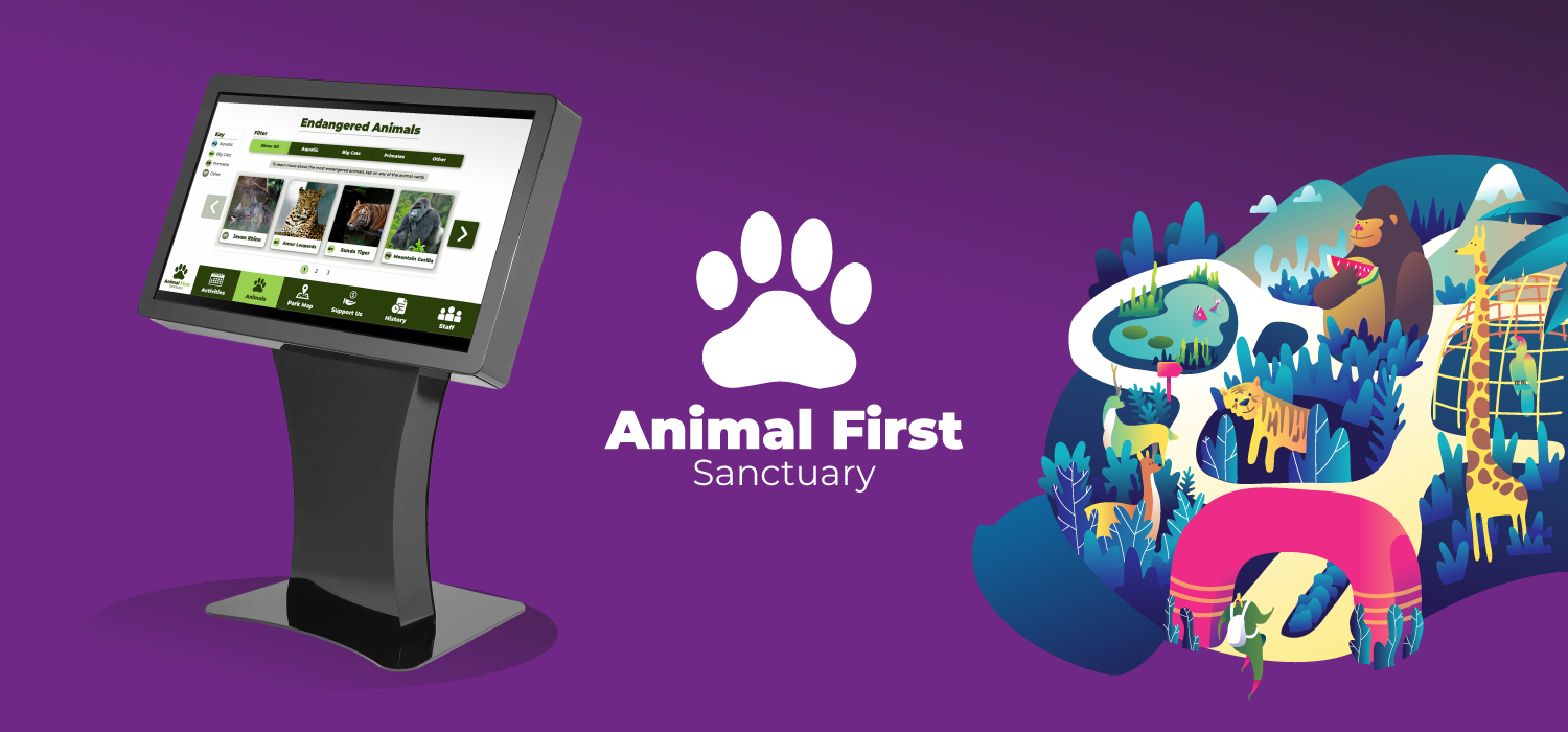
Overview
Animal First is an animal sanctuary, that wants to develop an engaging and accessible interactive guide to the park which will allow visitors to browse information via touchscreen kiosks located throughout the parkland, allowing the visitors to find answers to questions with ease and make the most of their visit. It is hoped that the kiosks will serve as fun but informative educational resources around the parkland of the sanctuary.
- Problem Statement
- Animal First's current information delivery system through staff tour guides and the visitor centre is leading to inefficiencies, communication challenges and staff overload. To aid visitors navigating the park leaflets have also become necessary, which conflicts with and hinders the sanctuary's sustainability goals.
- Goal
- To create an interactive prototype of the kiosk-based guide which can show how the guide will work.
- Timeline
- 12 Weeks
- Tools
- Illustrator, Photoshop, InVision, Figma, Optimal Workshop
- Target Audience
- Family groups and males/females over the age of 35.
- Roles/Responsibilities
- Entire product design from research to conception, visualisation, testing and interactive prototype.
Prototype
Research
I began the project by conducting primary and secondary research into the local taxi market in the area and understanding what type of users are most likely to need taxis. This included identifying the target audience, analysing the local competition, using personas, and focus groups. This identified the need to take advantage of a new website by creating a modern site to appeal to a younger audience and also make the process of online booking and information finding easier for older users (who comprise most of the current customer base). Carrying out this research enabled me to design solutions aligned with users and competition, as well as validate and remove assumptions.
Target Audience
After conducting research in the form of surveys, and reading the brief set, it is clear that the primary target audience for this informational kiosk would be families on a day out, or people above the age of 35. However, the sanctuary receives visitors of all ages and abilities, so the solution should show consideration for this, and be accessible for all. For example, wheelchair users should be given consideration to be able to use the kiosk also.
Literature Review
A Review of User-Interface Design Guidelines for Public Information Kiosk Systems
Upon reviewing the literature by Maguire in 1999, I was able to pick out some useful insights regarding considerations for the kiosk design:
- “Saturated and bright colours, with 3D shading for buttons” were found to be ‘playful, lively and motivating to use’. It was also the preference among both older and younger audiences.
- “Users will not have time or inclination to read lengthy instructions on screen before using a system”, therefore instructions should be minimal and not relied upon. Instead, the interactive elements should be intuitive enough for a user to be able to understand at a glance how they can use the system.
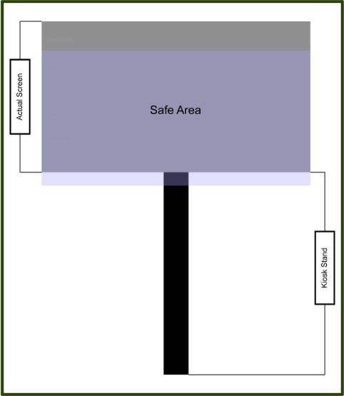
- Physical Areas: to be convenient to use for both standing and wheelchair users, interactive elements must be between 1.2 metres and 0.7 metres. A safe area of 50cm, which is shown on a diagram below, based on the ideal kiosk to be used for the system:
Focus Group Insights
“The interface should be fun and inviting”
“Should be quick and especially easy to use”
“Kiosks that bore you with lots of text and instructions are a drag... Most people skip it and just try to use the system”
“Ease of navigation is essential, tendency to get lost in pages otherwise”
Conducting a focus group was valuable as it brought together diverse users to engage in a real-time discussion, uncovered common pain points, generated ideas, and validated assumptions. It enabled a deeper understanding of user preferences and attitudes, helped identify specific issues, and empowered users in the design process, leading to a more user-centred and successful website redesign.
Personas
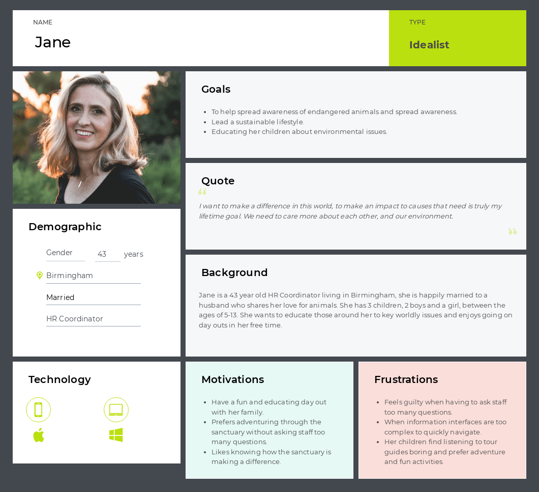
This is one of the personas used to understand the users of the kiosk system. The persona represents an individual called Jane.
Using personas allowed me to represent the goals, motivations, behaviours and characteristics of a group of users that are likely to use this interface. Making it easier to inform user-centric design decisions that empathise with the user and their expectations.
Conceptual Design
Card Sort
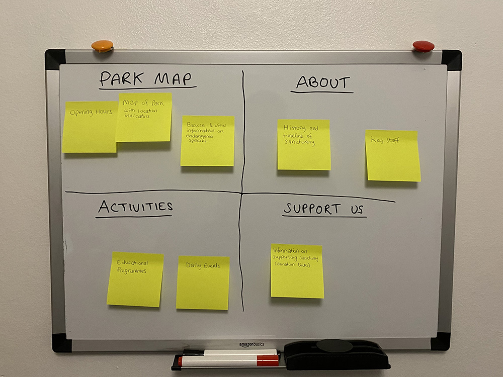
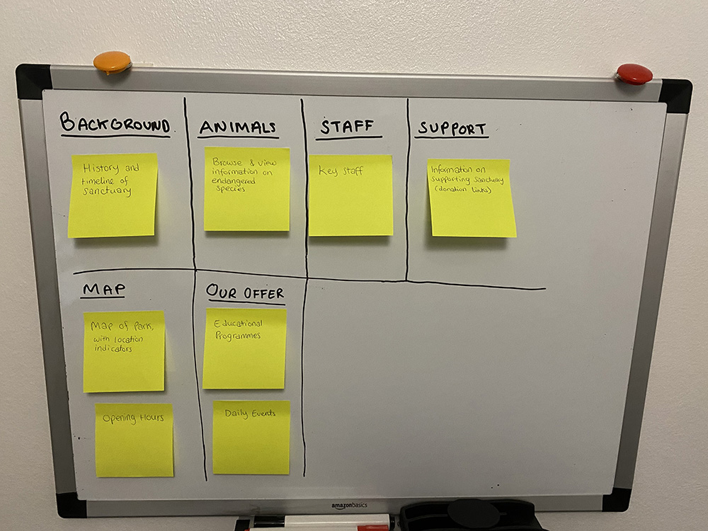
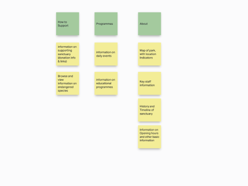
I conducted card sorts with multiple participants, using post-it notes for in-person card sorts, and also using Optimal Workshop to conduct card sorts online.
I used card sorting to find out how users think the content should be organized. The goal was to arrange the content in a way that makes sense to users.
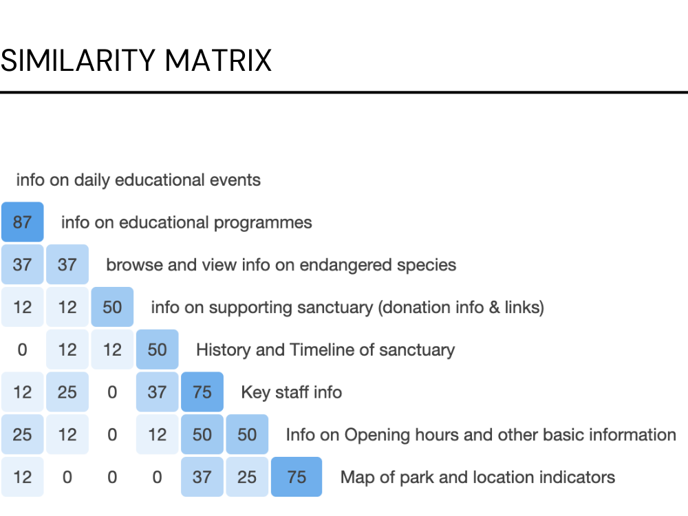
Following, I generated a similarity matrix to gain a high-level overview of the responses.
Site Map

After analysing the card sort results, and taking into account focus group insights, it was decided to put content where majority of users were in agreement under one page, and unpack all other sections into different pages to allow for ease of navigation, as a nested structure could create confusion.
Use Case Diagram

This is an example of a path the user may take through the system. In this example, the user wishes to view the location of the Leopard enclosure within the sanctuary park, and see what Leopards are housed within the enclosure in the sanctuary.
Storyboarding
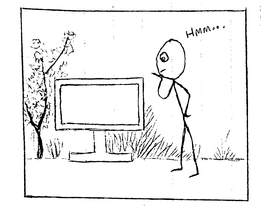
1. User approaches kiosk.
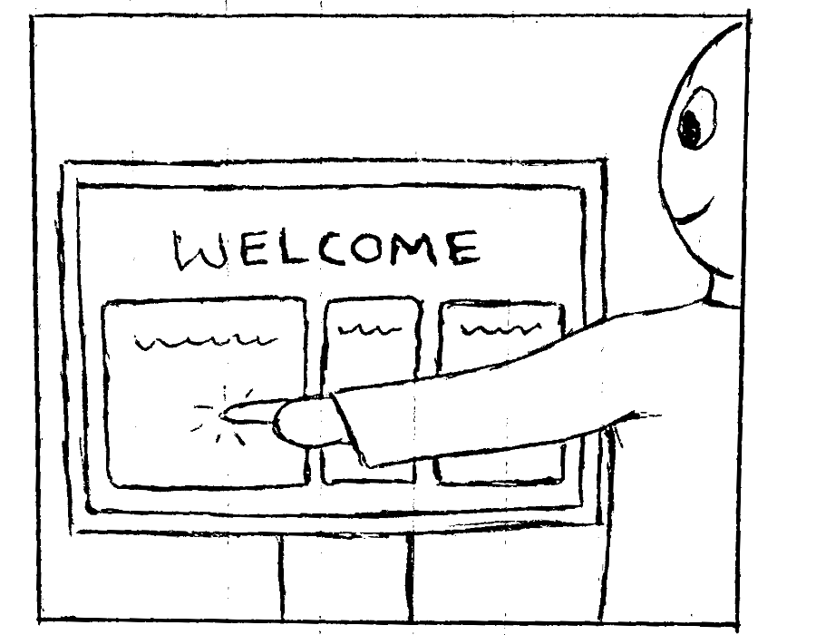
2. User selects the Park Map option from the Welcome screen.
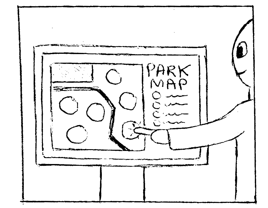
3. User taps the Gorilla icon from the Park Map screen.
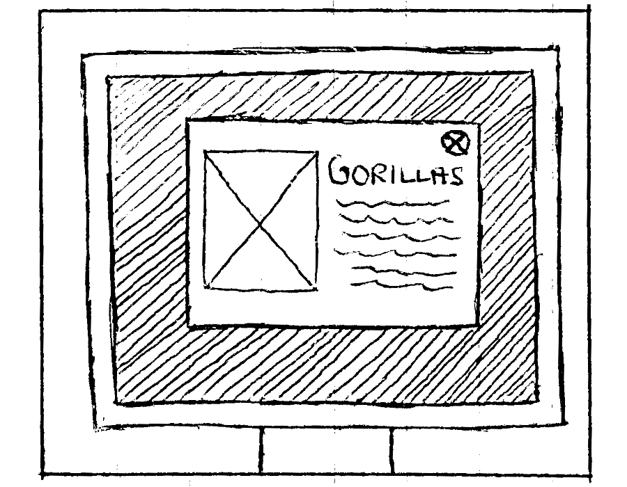
4. A pop-up is displayed showing information on Gorillas within the sanctuary.
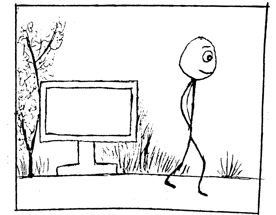
5. User exits the system.
Storyboarding allowed me to visualise user interactions with the system and communicate expectations. It helps to visualise the entire process and narrative of interacting with the system, and draw attention to any external factors that may need to be considered, in addition to the screen itself.
For instance, this storyboard demonstrates that the kiosk will be situated in an outdoor public environment and placed on a kiosk stand. The storyboard reminds me that it is crucial to consider this aspect in parallel to all design decisions and that it is entirely different from designing for a typical desktop or mobile system.
I.e. To minimise the rate of user error, buttons will need to be larger since users will be further away from the screen and will pay less attention than they typically might with a mobile or desktop screen.
Low-Fidelity Wireframing

I used two different processes to create low- and mid-fidelity wireframes: firstly I utilised rough paper-sketches and then Figma to create a clearer overview of the layouts for the system pages. Not only did this help save time when designing the final product, as time is not wasted on visual details, but it also allowed me to receive feedback early on in the lifecycle.
A key pattern in use with the wireframes is obviously the global navigation pattern, where the navigation bar appears on every page at the top. However this navigation bar also unpacks each page from the site into the navigation bar. Removing the need for guess-work with ambiguous category names, by aggregating all the site content into just 5 separate pages, this is possible without overflowing/complicating the navigation. This was achieved by conducting a card sort, which helped to identify what content should be grouped together to allow convenient navigation.
I also made use of popups, to limit the amount of navigation and context switches a user would have to endure to find information. Rather than navigating through an endless nested system of child pages.
Branding
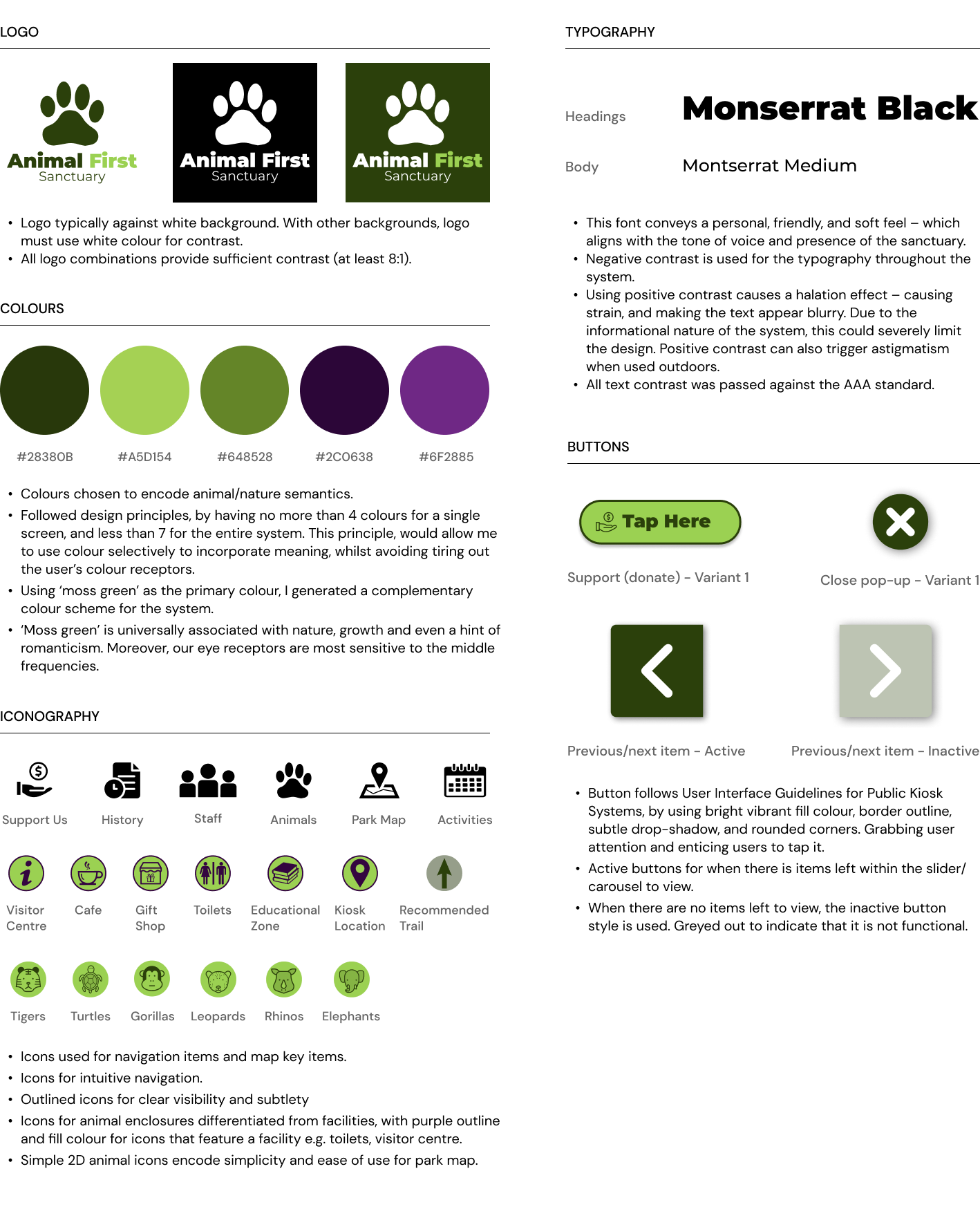
A branding kit is a collection of pre-existing branding elements, serving as a guide and a point of reference for future design work and fostering collaboration within the team. It consolidates various branding elements into a unified document, serving as a guide for the team when making design decisions related to logos, typography, colour schemes, and iconography.
To establish the brand's identity and give credibility to my designs, I took the initiative to create a fresh company logo. My process began with brainstorming words connected to the brand's characteristics and generating numerous logo concepts. Subsequently, I selected and shortlisted a few ideas, carefully evaluating their legibility across various scales and their suitability within the context and 'feel' of the website.
A key consideration for each branding decision, other than accessbility, was to encode nature and animal semantics. I.e. the primary colour is green, since this is commonly associated with nature.
Colour-Blind Simulation
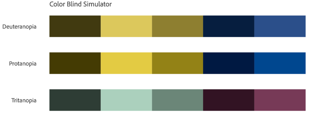
To ensure accessiblity and suitability for colour-blind users, I made use of Adobe’s accessibility tools and checked the colours against the AAA contrast standard. The figure above, shows the colour-blind simulation.
User-Flow
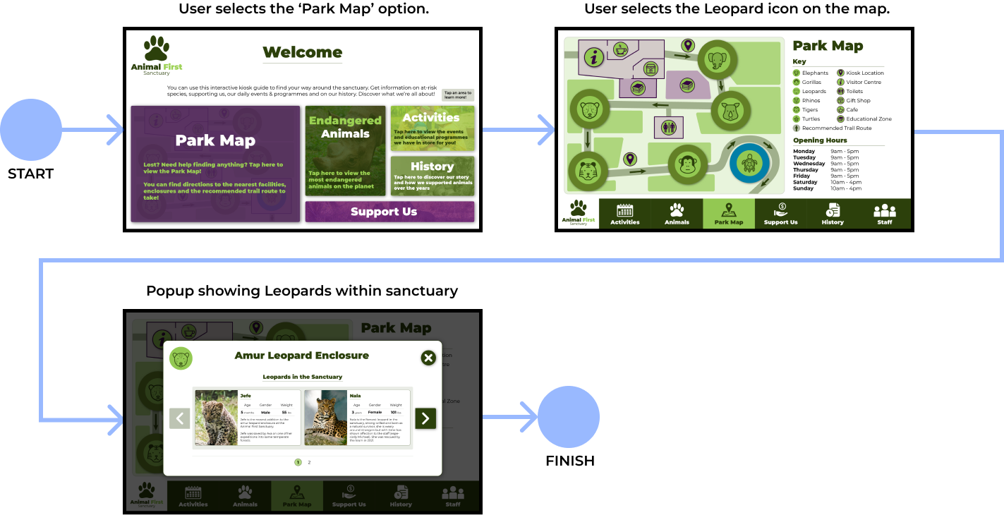
Following the low-fidelity wireframes, identifying the colour scheme and the typography, I created high-fidelity wireframes and designed user flows for typical paths the user may take to achieve specific purposes using the system. Above is one of the user flows I created.
A/B Testing

Goal: To increase engagement and speed of interacting with the timeline of the sanctuary.
Hypothesis: I think that the design A has more intuitive time buttons and so should be quicker to use and understand, than B, as it looks more like image holders, rather than buttons.
I conducted a focus group, where I gave two groups of users a task to use the History page to learn more about the sanctuary’s background, the time it took each individual to interact with the CTA (the time buttons) was timed, and averaged for each group. The results from this showed that users that used design A, took less time to scan the page and tap on the buttons, whereas in B, they took quite a bit longer. This supports my initial hypothesis that A is the more efficient and intuitive design, and so was used over B.
Final Design
Screens & Pop-Ups
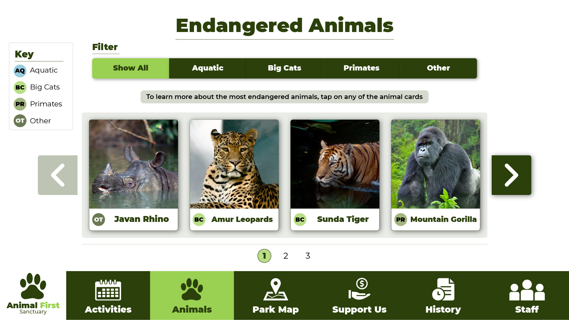
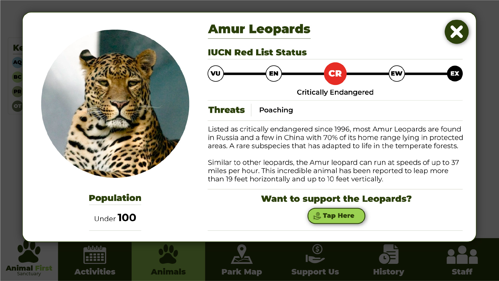
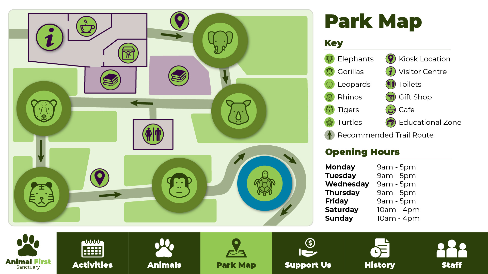
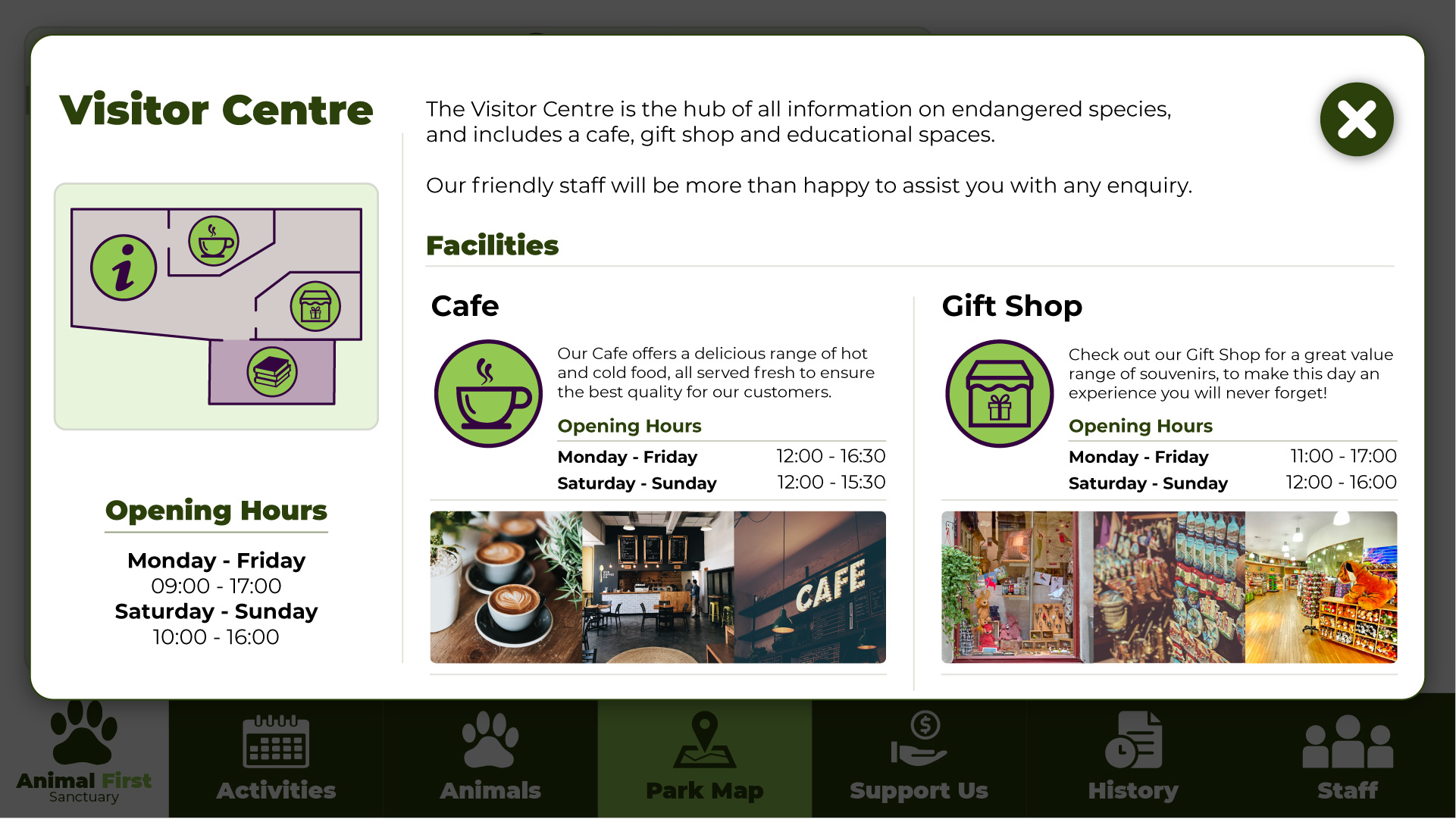
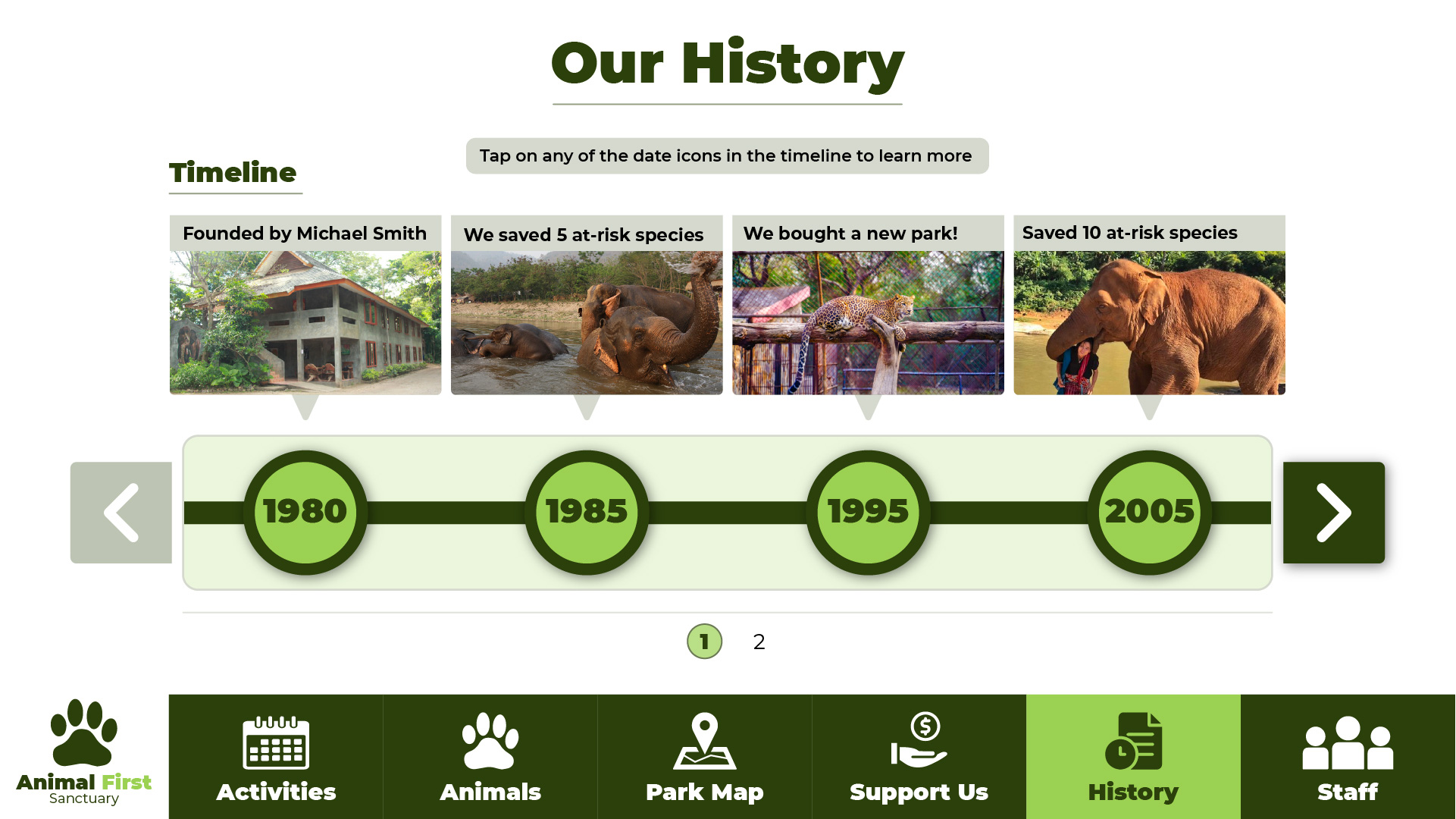
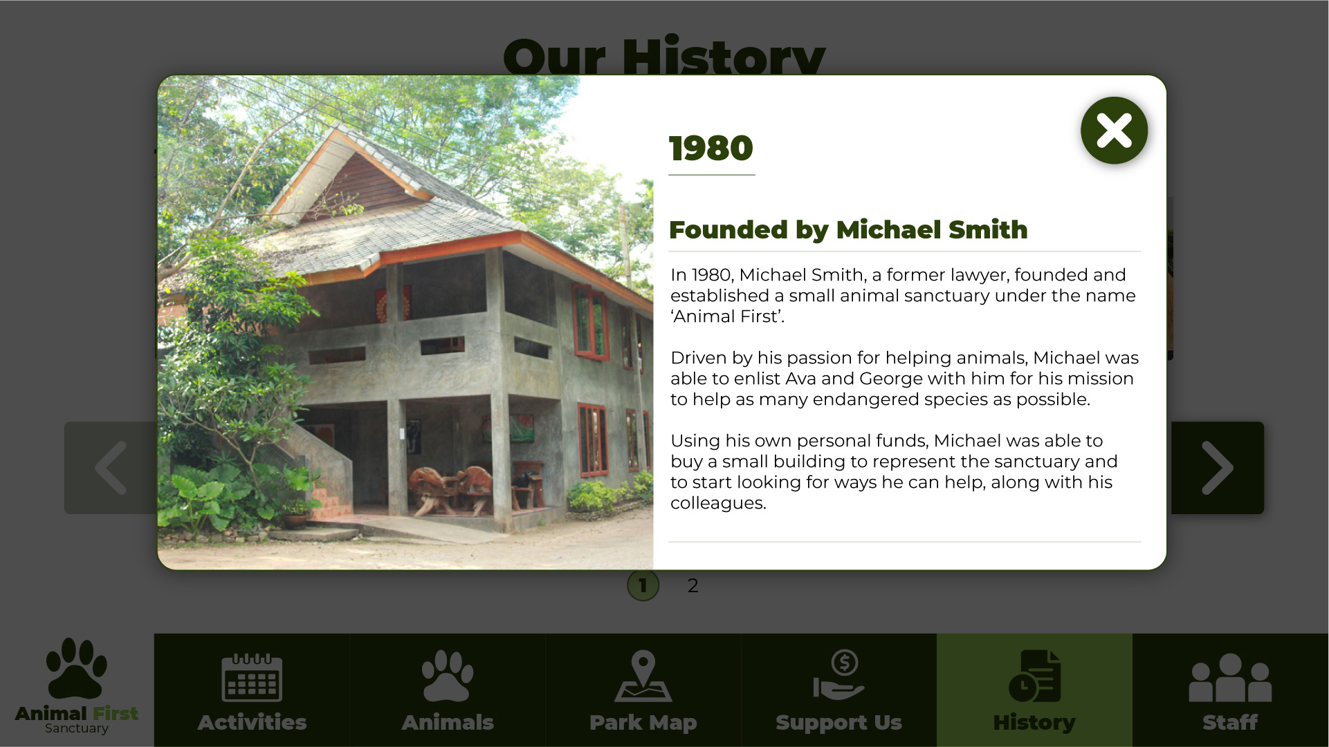
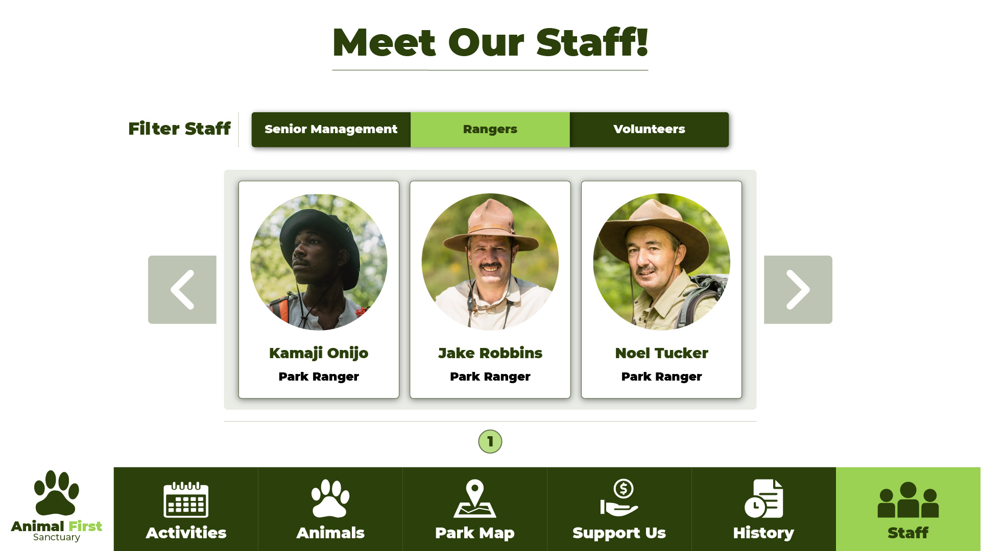
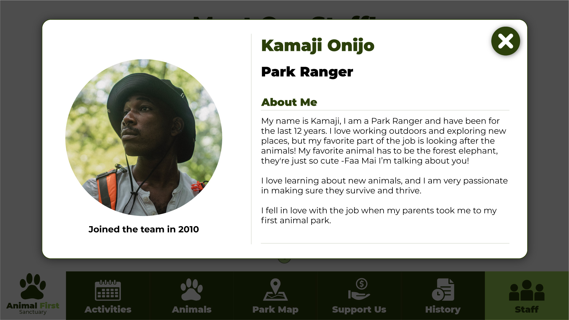
After completing the design and ideation stages, I put all the screens together in InVision and created the interactive prototype. Since this was a project for my Interaction Design module, it was marked and I was awarded a First Class grade. View the InVision prototype by clicking the button below, or alternatively the Figma button for the figma version.


