Website Redesign: Chelmsford Taxis & Cars
Overview
I was hired on a freelance basis as a Web Designer for Chelmsford Taxis & Cars. I took on the end-to-end responsibility of researching, prototyping and launching a brand new website to help them become digitally competitive and market their services online, replacing their outdated website which did not align with the brand. The process included creating an entirely new brand guide and logo for the company to use, this was necessary to support them in creating consistent content that could all be linked to their brand.
- Problem Statement
- Chelmsford Taxis and Cars, a reputable taxi company, has an opportunity to enhance their digital presence by updating their website. The current website is struggling to compete with competitors' user-friendly and modern websites and booking processes. The website lacks visual appeal and an intuitive navigation, which could help meet the evolving expectations of customers. The existing website does not meet the standards that customers have grown accustomed to with more modern websites, likely resulting in a negative user experience.
- Goal
- Streamline the booking process and enhance the user experience to increase the conversion rate of website visitors to customers.
- Create a modern website design that reflects the brand identity and is line with current UI design trends.
- Improve the website's overall user experience and make it intuitive and easy to navigate.
- Timeline
- 10 Weeks
- Tools
- Illustrator, Photoshop, Figma, Optimal Workshop, Google Forms
- Target Audience
- Primarily local residents over the age of 45, but also clubbers aged 20-30.
- Roles/Responsibilities
- Entire product design including research, conception, visualisation, testing and interactive prototype. I was also asked to implement, create and launch the site.
Prototype
Research
I began the project by conducting primary and secondary research into the local taxi market in the area and understanding what type of users are most likely to need taxis. This included identifying the target audience, analysing the local competition, using personas, and focus groups. This identified the need to take advantage of a new website by creating a modern site to appeal to a younger audience and also make the process of online booking and information finding easier for older users (who comprise most of the current customer base). Carrying out this research enabled me to design solutions aligned with users and competition, as well as validate and remove assumptions.
Target Audience
Most current users are older local residents who they have built trust with.
However, there is a missed opportunity of marketing to a younger audience, particularly club-goers since there is an active nightlife in the area on weekends.
Market & Competitive Analysis
In the past, Chelmsford Taxis & Cars used mainly print mediums to market their business and neglected digital communications since they had a high amount of market share and this was also before the rise of online bookings and convenient apps like Uber.
The current company website has not been updated in years and has a very archaic feel in comparison to other local taxi firms.
The current competition leading the market, is Happicabs, who have a sleek, modern and easy to use website for booking taxis and finding information. Hence, the new website needs to be modern and feel like a complete revamp to help reposition the company in the market, specifically by making the process of online bookings and information finding easier and enjoyable.
Focus Group Insights
“The website looks very outdated, it’s clear everything needs a fresh look”
“It looks similar to untrustworthy sites, like those that spread malware”
“The provided information is quite limited and also difficult to find”
“Basic information like pricing has been left out and the mobile version is hard to navigate”
Conducting a focus group was valuable as it brought together diverse users to engage in a real-time discussion, uncovered common pain points, generated ideas, and validated assumptions. It enabled a deeper understanding of user preferences and attitudes, helped identify specific issues, and empowered users in the design process, leading to a more user-centred and successful website redesign.
Personas
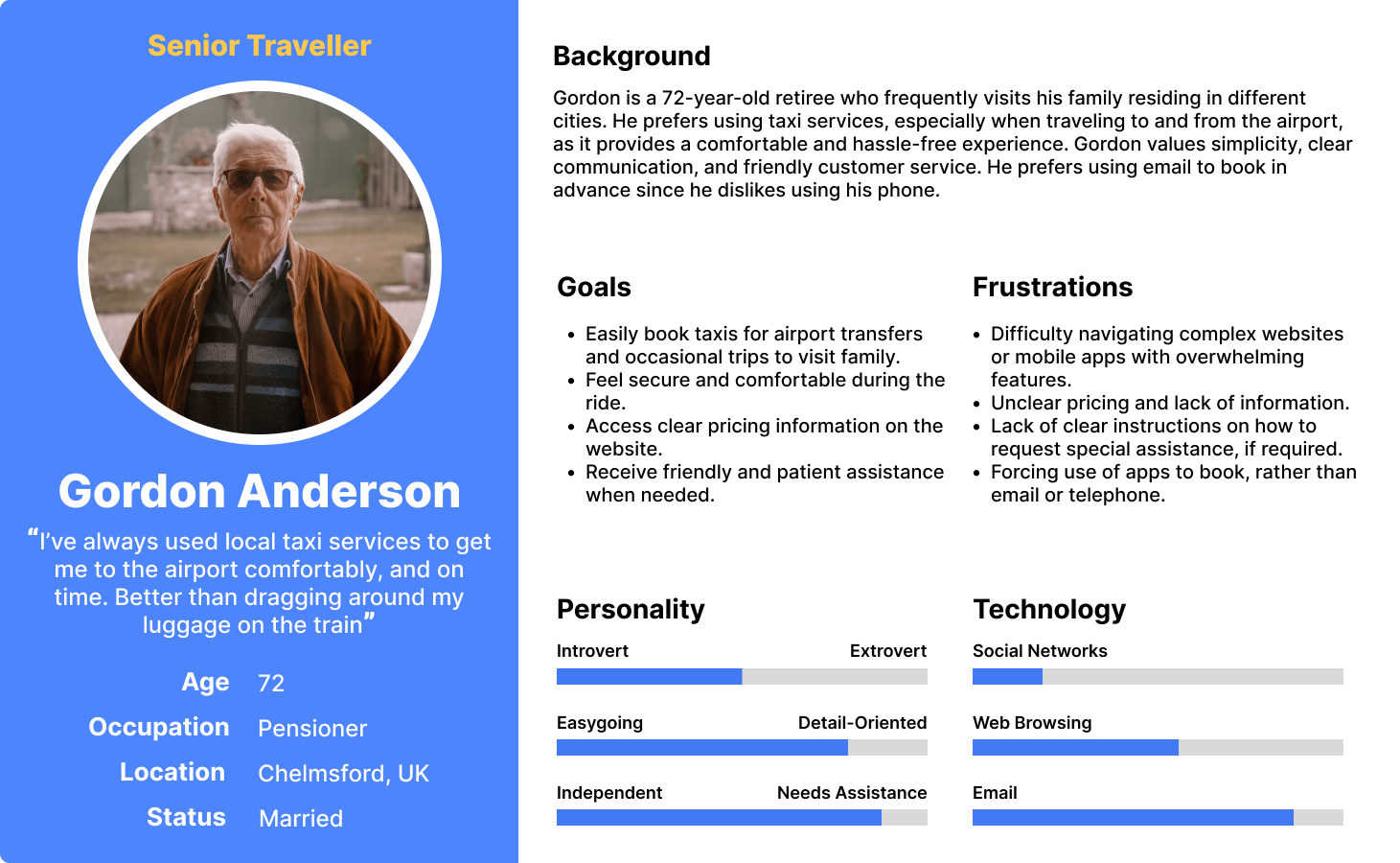
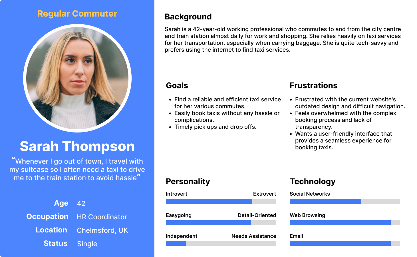
I generated personas to gain an understanding of the target audience. This included an insight into what their goals and pain-points are regarding using taxi booking services. It also highlighted the importance of considering that most of the target audience is older, and would have limited technical skills, meaning the website should make the process of booking and finding information, as easy as possible.
Conceptual Design
Card Sort

Similarity Matrix

I conducted card sorts with multiple participants, using Optimal Workshop to conduct card sorts online.
I used card sorting to find out how users think the content should be organized. The goal was to arrange the content in a way that makes sense to users.
Following, I generated a similarity matrix to gain a high-level overview of the responses. The similarity matrix showed definitive results, helping to establish what content should have its own dedicated page and what pieces of content should be grouped together under a single page. It also helped to ideate relevant category names.
Site Map

After analysing the card sort results, and taking into account focus group insights, it was decided to put content where majority of users were in agreement under one page, and unpack all other sections into different pages to allow for ease of navigation, as a nested structure could create confusion.
Sketching & Wireframing
Wireframe sketches

Responsive Wireframes

I used two different processes to create low- and mid-fidelity wireframes: firstly I utilised rough paper-sketches and then Figma to create a clearer overview of the layouts for the system pages. Not only did this help save time when designing the final product, as time is not wasted on visual details, but it also allowed me to receive feedback early on in the lifecycle.
A key pattern in use with the wireframes is obviously the global navigation pattern, where the navigation bar appears on every page at the top. However this navigation bar also unpacks each page from the site into the navigation bar. Removing the need for guess-work with ambiguous category names, by aggregating all the site content into just 5 separate pages, this is possible without overflowing/complicating the navigation. This was achieved by conducting a card sort, which helped to identify what content should be grouped together to allow convenient navigation.
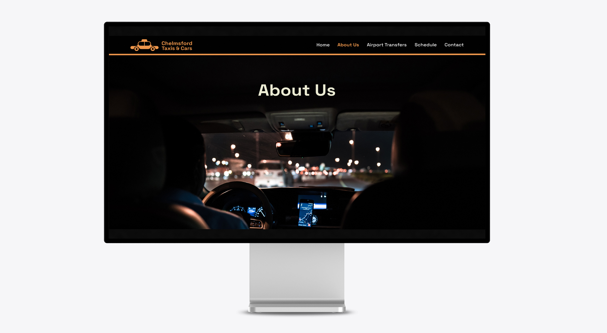
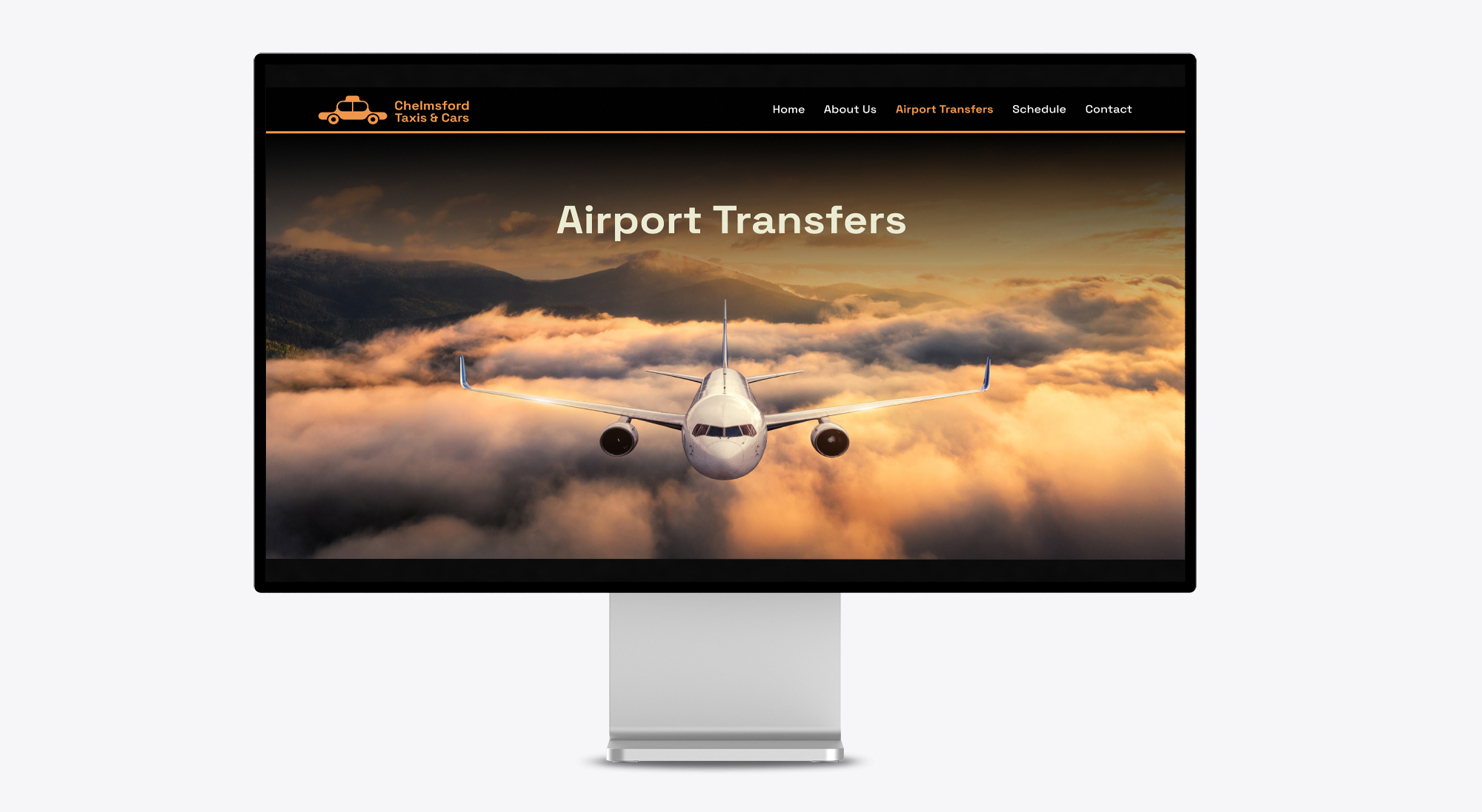
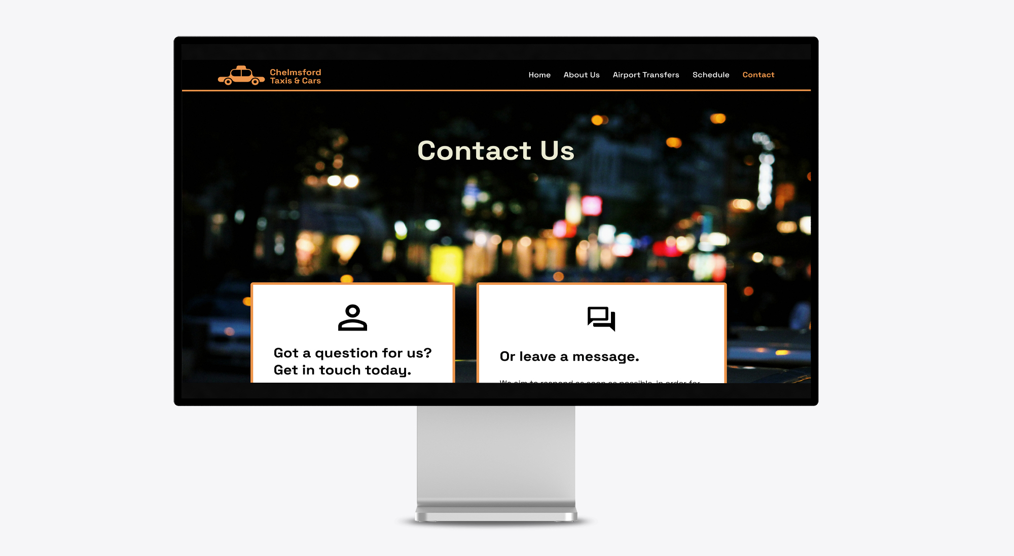
I also made use of Jakob’s Law – which states that since users spend most of their time on other sites, they would prefer all sites to work the same way. Hence, I analysed the top sites in general and for bookings (such as Uber), and pulled conventions for my own designs. For example, I saw that for desktop devices, it is common to have a full size image banner, which communicates the feel and mood of the brand to the user. It also relaxes them and excites them for what they might find below, serving as a soft introduction to page.
Branding & UI Kit
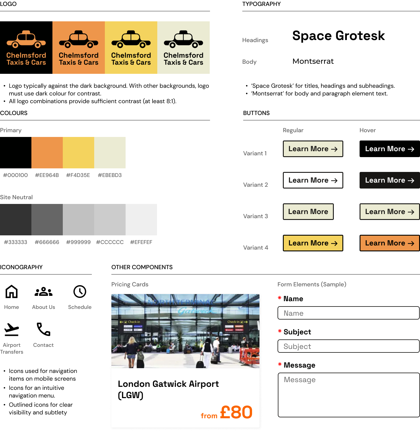
A UI Kit is a collection of pre-existing UI elements found on the website, serving as a guide and a point of reference for future design work and fostering collaboration within the team. It consolidates various branding elements into a unified document, serving as a guide for the team when making design decisions related to logos, typography, colour schemes, components, and iconography.
To establish the brand's identity and give credibility to my designs, I took the initiative to create a fresh company logo. My process began with brainstorming words connected to the brand's characteristics and generating numerous logo concepts by sketching. Subsequently, I selected and shortlisted a few ideas into digital formats, carefully evaluating their legibility across various scales and their suitability within the context and 'feel' of the website.
In terms of colour, I selected black and orange as the primary brand colours since they are often associated with taxis. Originating from London, taxi cabs have a deep rooted history within our society and it is important the colours draw on that. Yet at the same time, if i simply went with black, the brand would be too unoriginal, since it would be too similar to other taxi services and companies. Having orange as the primary brand colour, makes the brand unique and differentiates it from the competition whilst encoding a sense of tradition.
Final Design
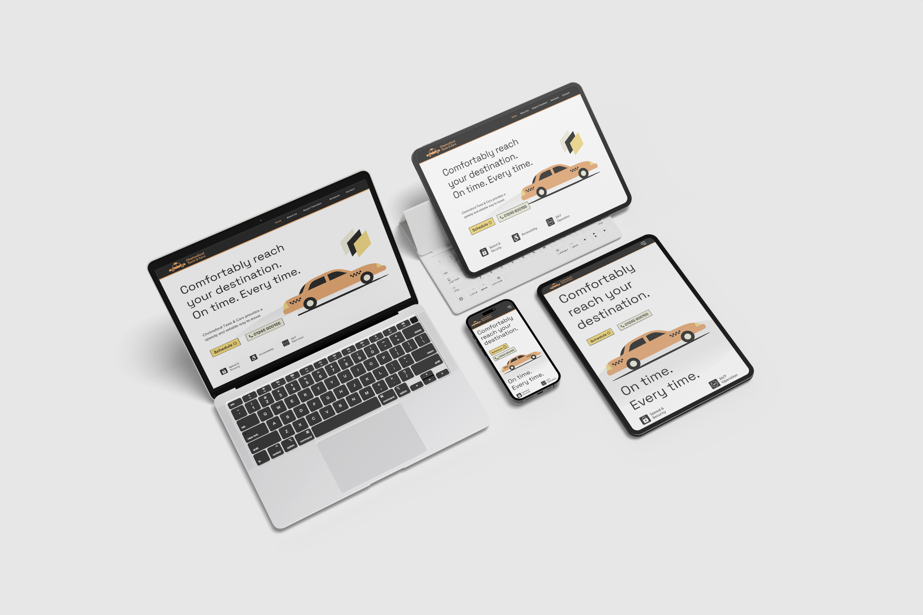
Responsive Web Design
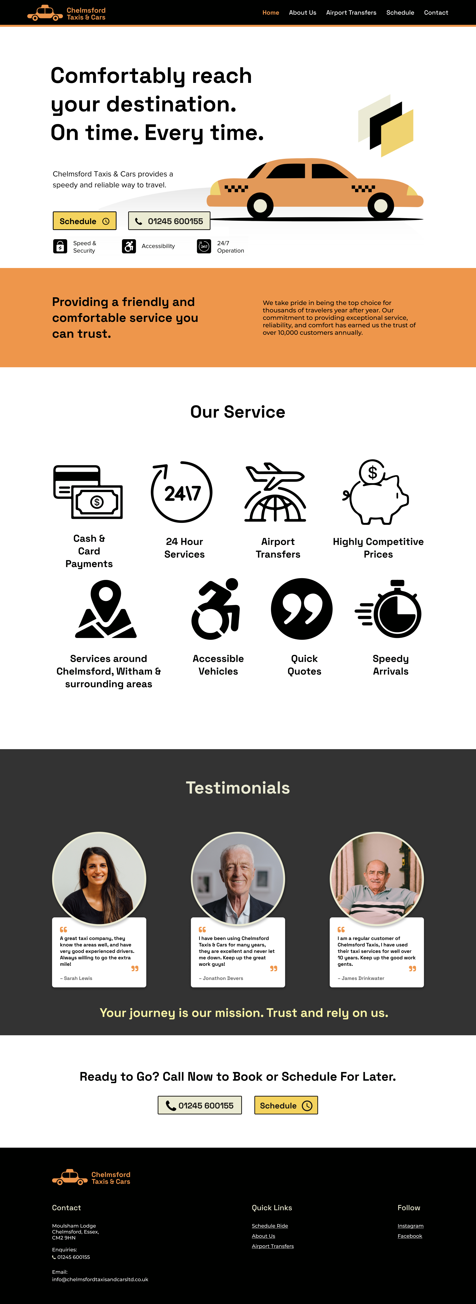
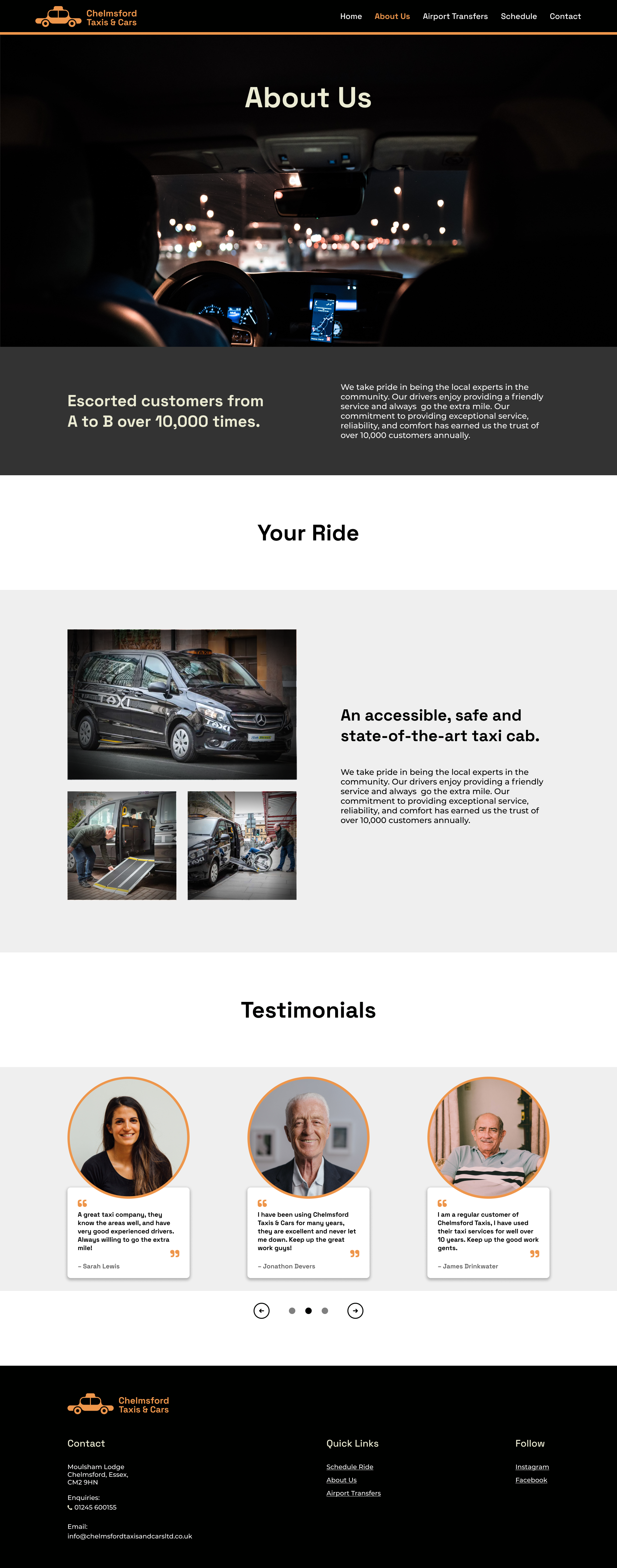
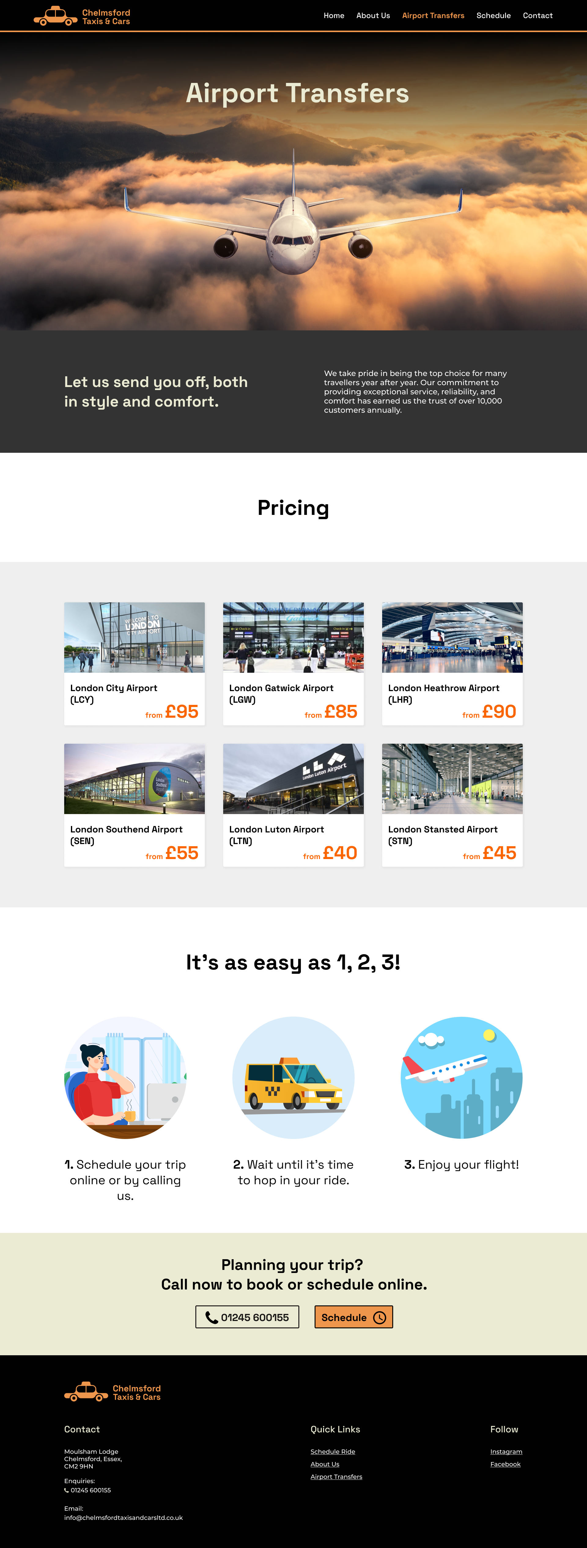
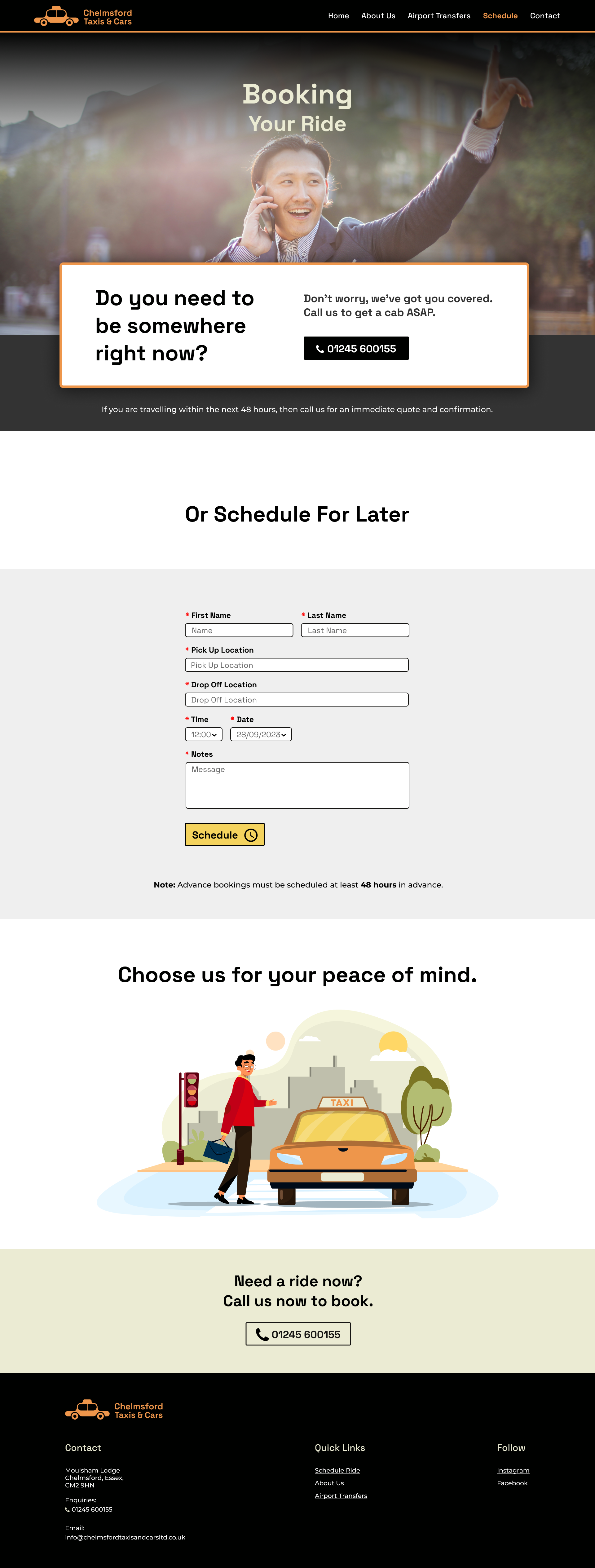
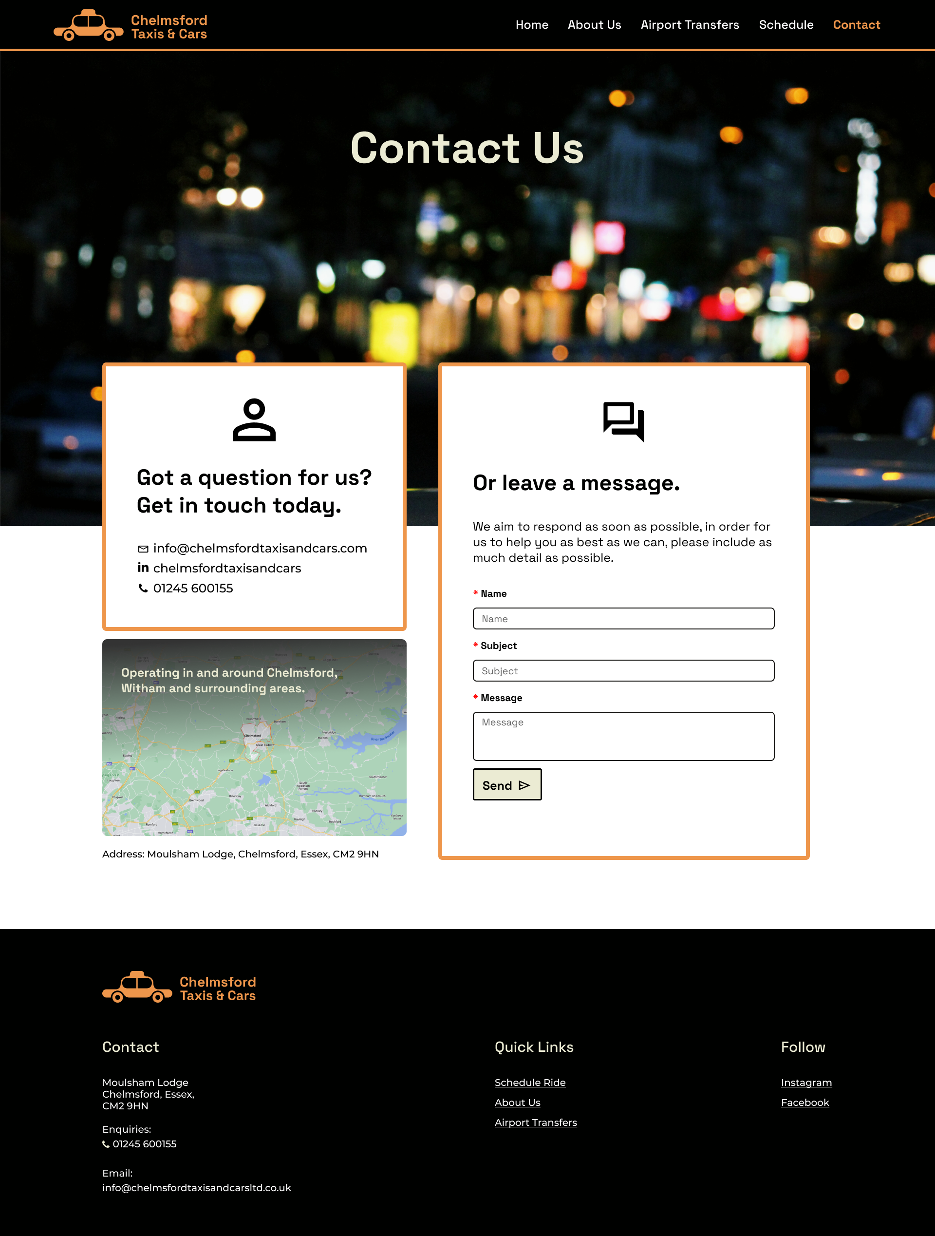
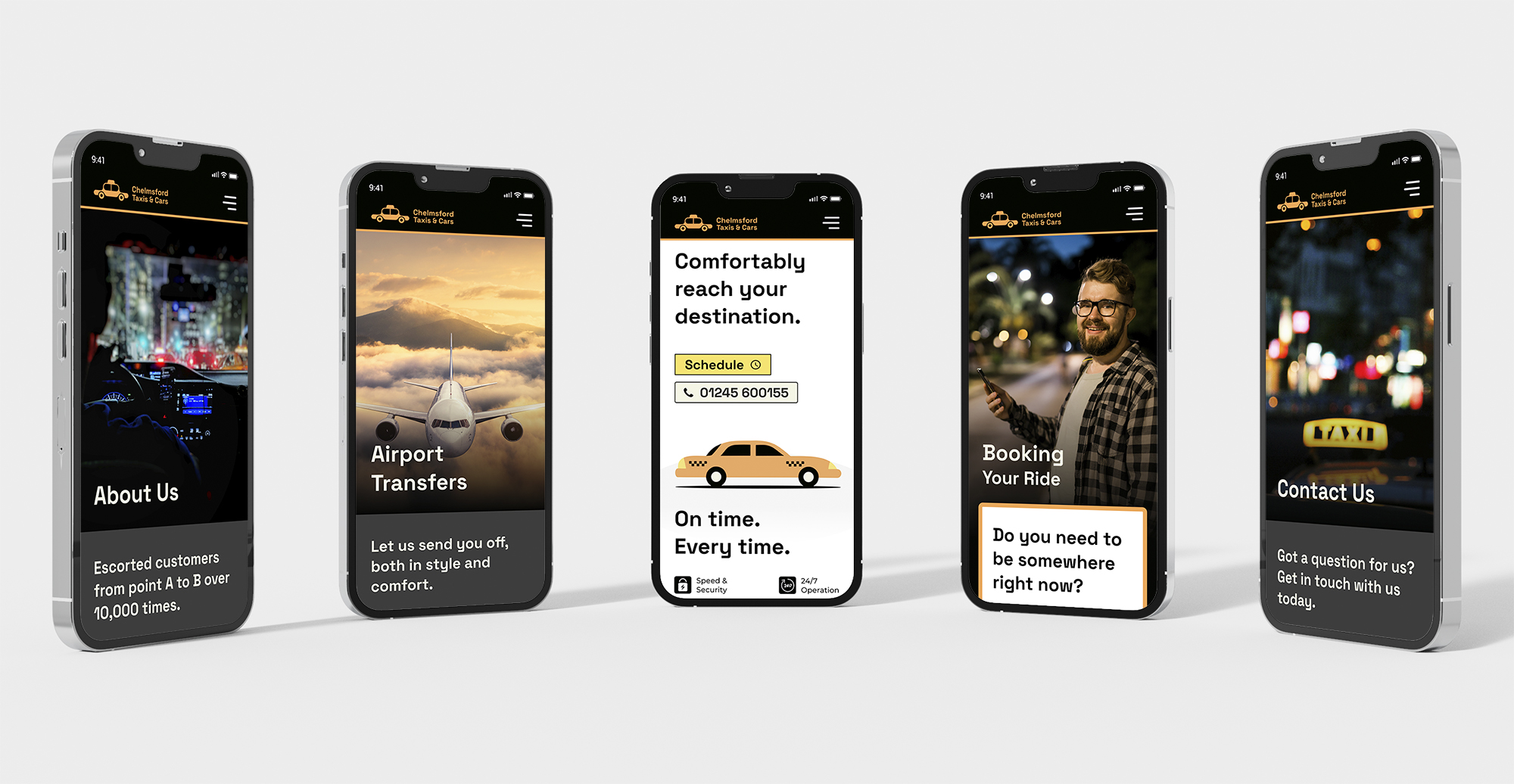
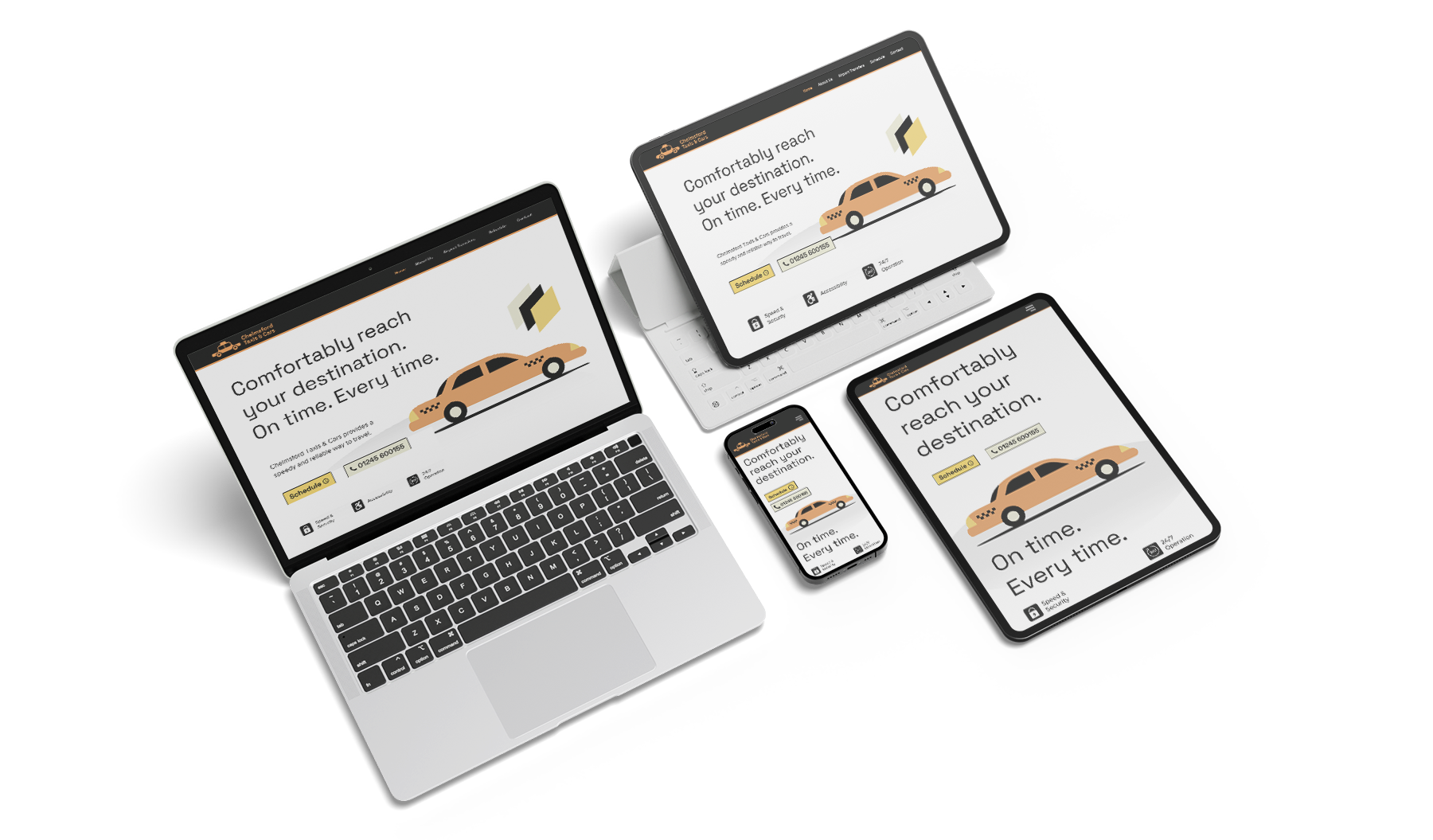
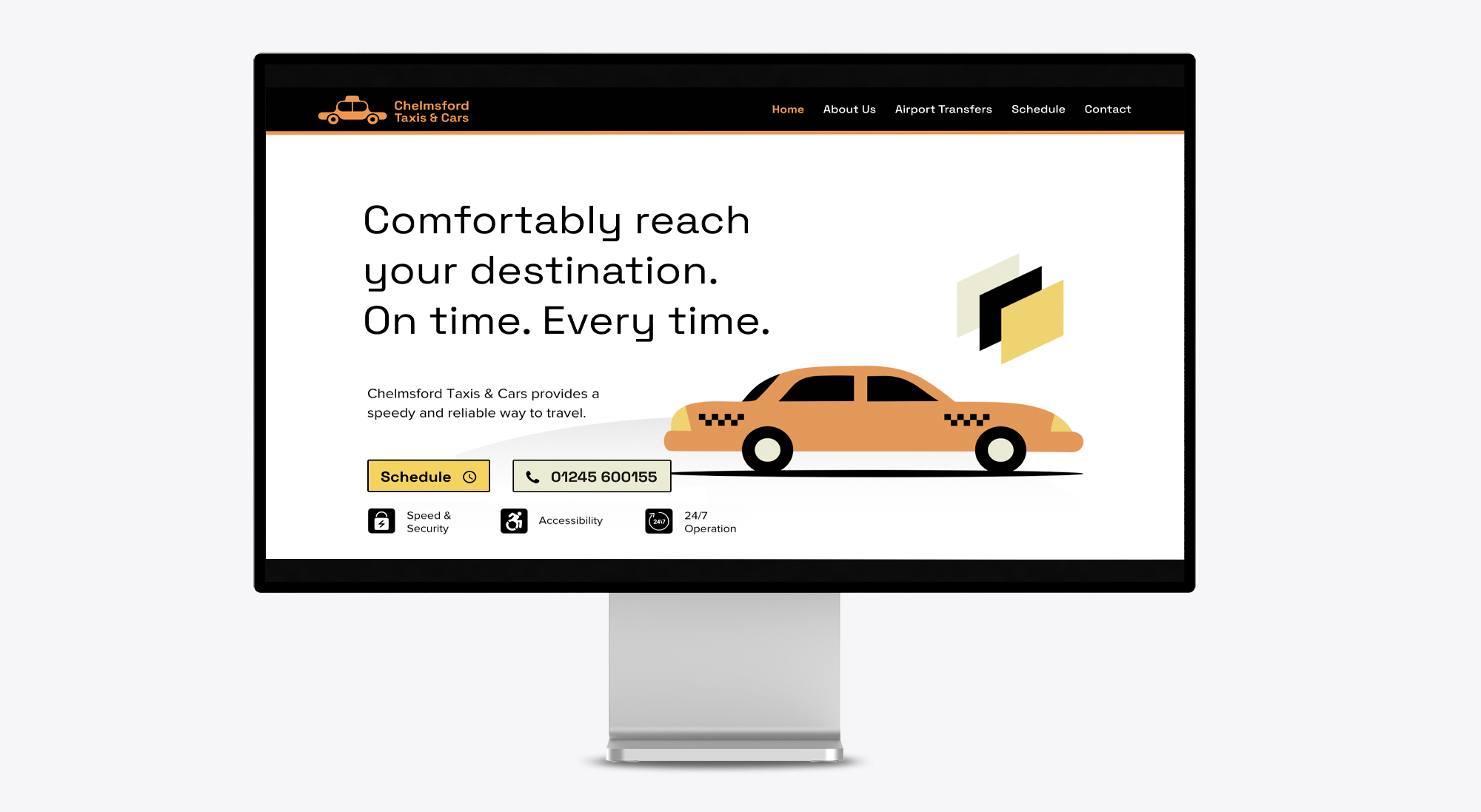
After drafting the original high-fidelity wireframes for different devices (desktop, mobile, tablet), I iterated over the final design many times to ensure that it was comfortable to use for the target audience. Since it is for an older demographic, the design should be as intuitive as possible and not assume any kind of technological proficiency.
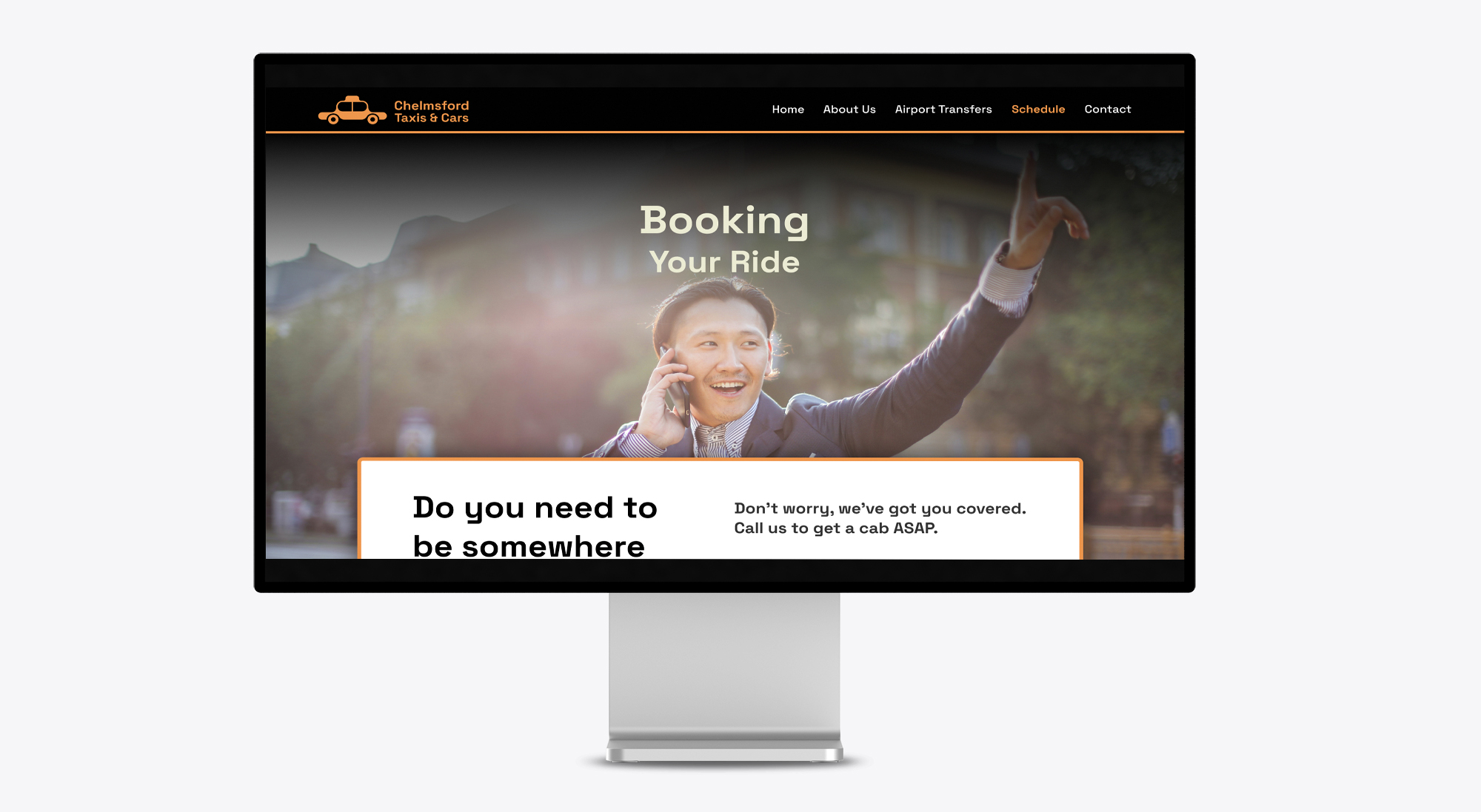
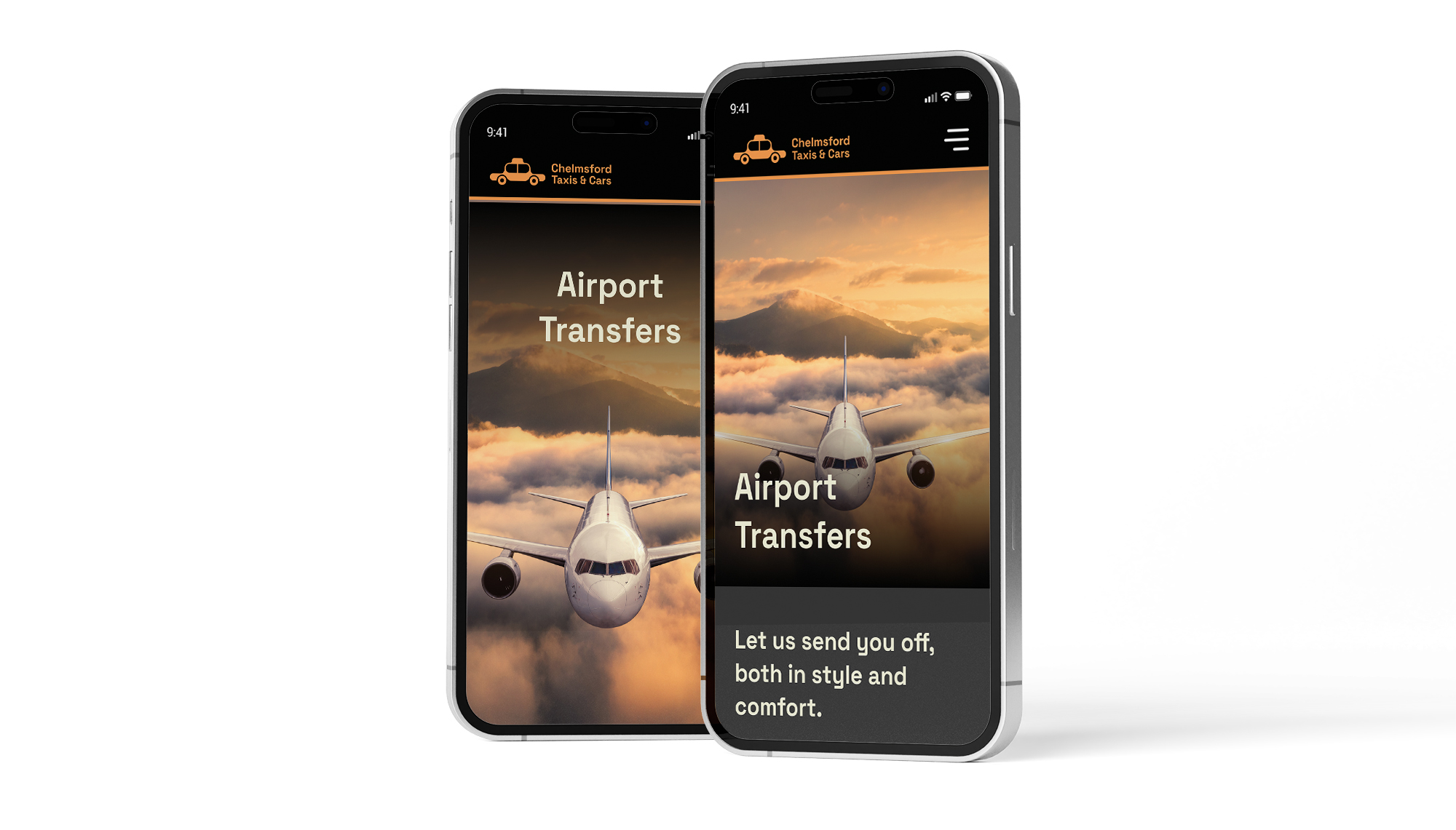
High fidelity wireframes allowed me to test the key user tasks I identified in my research. The UI test revealed that while the tasks were pretty straightforward, some elements needed to be reconsidered. Many test subjects, reacted negatively to the full screen banner on mobile for the secondary pages, which prompted them to stay in the same position, rather than scroll down to reveal the rest of the page content. To address this, I ensured the banner left some room at the bottom of the screen, so when users land on the page, they would see some of the rest of the page’s content poking through. Establishing a much more intuitive page which encourages users to flick through content. By providing a clean, modern and crisp design, users are not fatigued by a small amount of scrolling and would in fact enjoy the experience, compared to previously.
The below image illustrates the previous design against the new design in consideration of this:
Desktop Screen
Usability Testing
To prepare for the testing process, I began by drafting a usability testing plan. This plan served as a crucial blueprint outlining the specific elements I aimed to assess and the underlying reasons for conducting the tests. Establishing clear test objectives, selecting appropriate participants, determining the methodology, outlining tasks, and defining assessment criteria were all integral components of this planning stage.
Following the development of the usability testing plan, I proceeded to execute both in-person and remote usability tests, involving a total of five participants. During these sessions, I meticulously observed their interactions with the prototype and diligently documented their errors, slip-ups, and instances of confusion that arose throughout the process. These transcripts effectively served as raw data, providing a valuable foundation for summarizing user interaction patterns with the prototype.
Reflection
Overall, during this project, I enthusiastically embraced the principles of design thinking. While the journey was undoubtedly challenging, I enjoyed every moment of it. Beyond the invaluable insights I gained from engaging with users during interviews, a key takeaway was the art of underpinning each design choice with meticulous research, thus eliminating any room for ambiguity.
Furthermore, I was struck by the significance of usability testing, which unearthed usability hurdles that had previously eluded my eye. In totality, this experience enriched my comprehension of the UX design process and its relationship with the dynamic world of web design.
Was the problem solved?
The primary challenge was the site's ability to compete in the local taxi market. The existing user interface lacked modern design, conventions, and branding, which impacted user experience.
My project aimed to solve this problem through a comprehensive redesign. I incorporated contemporary design principles and industry standards, resulting in a clean, intuitive, and aesthetically appealing interface. My process included extensive user research and feedback from focus groups, ensuring the design catered to their preferences, expectations and needs.
The revamped website now stands as a modern, user-friendly, and visually appealing platform that aligns with industry standards and resonates with the target audience, effectively addressing the problem statement.


